Pillars Brewery Brand Identity Packaging
Year-on-year growth is a good problem to have, but it left Pillars Brewery with a sprawling range of beers and a brand that no longer matched their ambition. They needed to consolidate their identity and create a brand that truly represented their vision for the future of craft lager.

The Challenge
East London lager specialists in a market obsessed with ales? A bold move, but Pillars had the vision; they just needed a brand bold enough to tell their specialist story. We needed to solve the inconsistencies, clarify the product line and clearly communicate why their lager deserved the attention of the picky London drinker.


The Solution
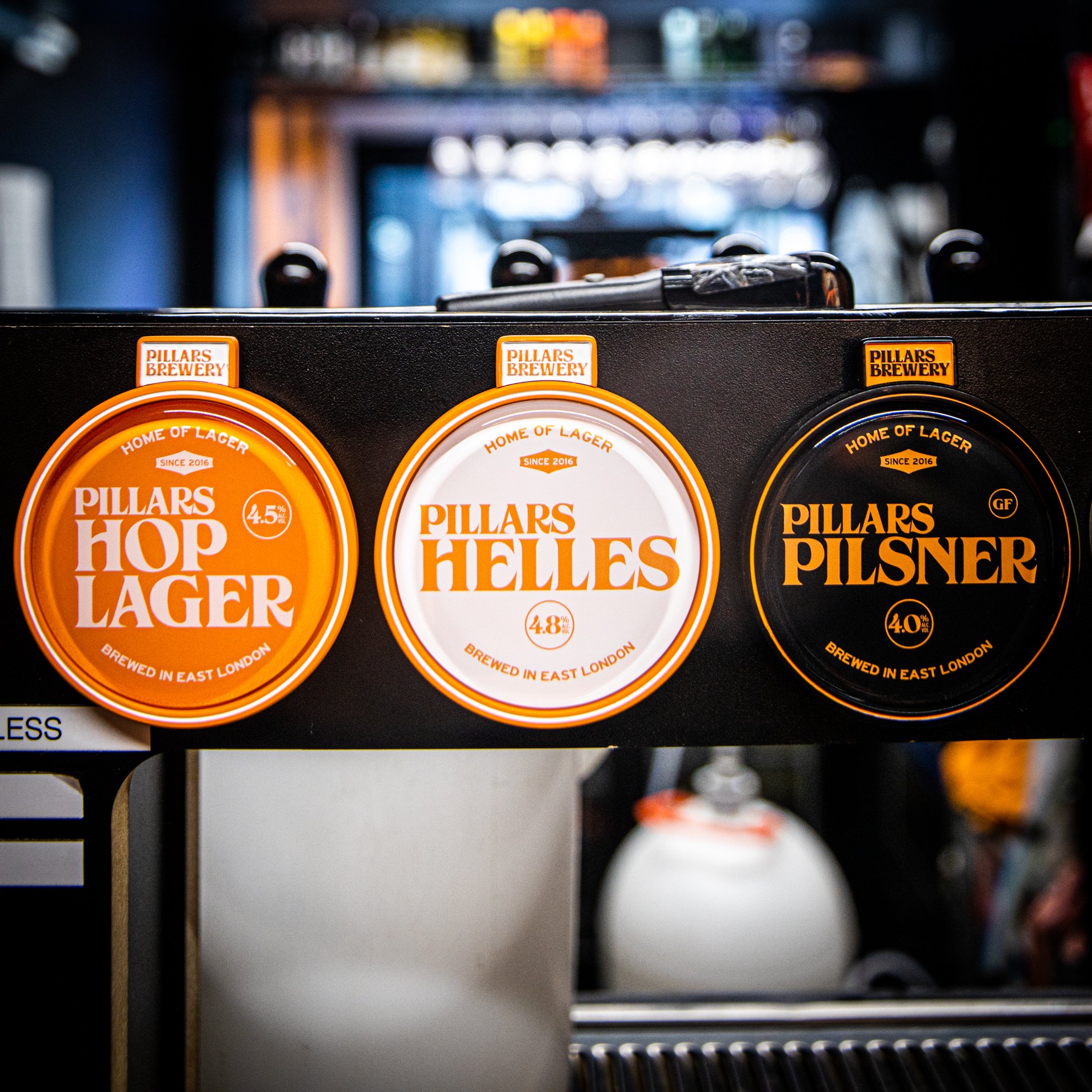
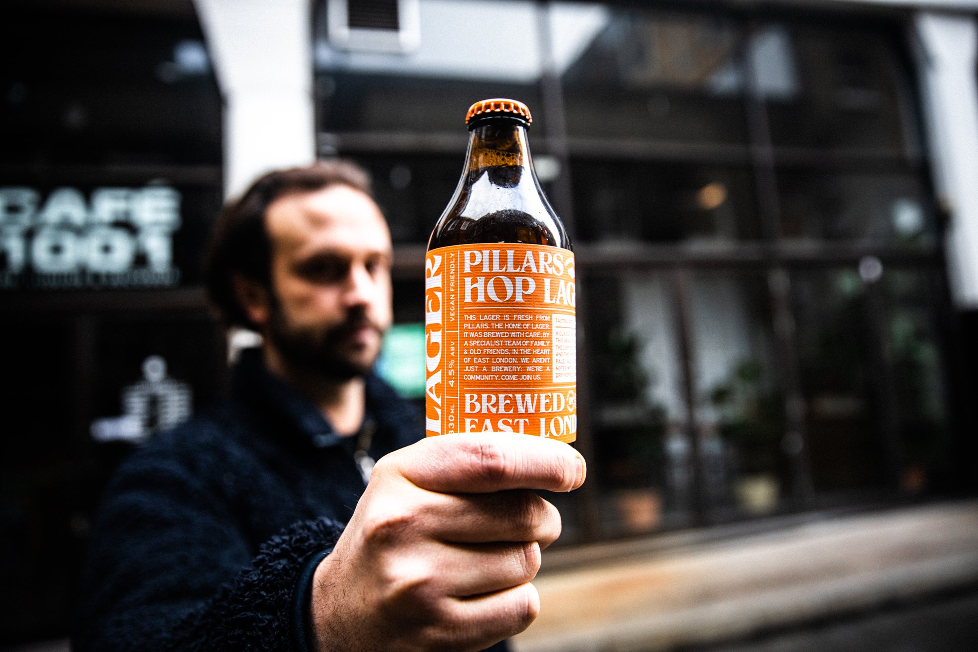
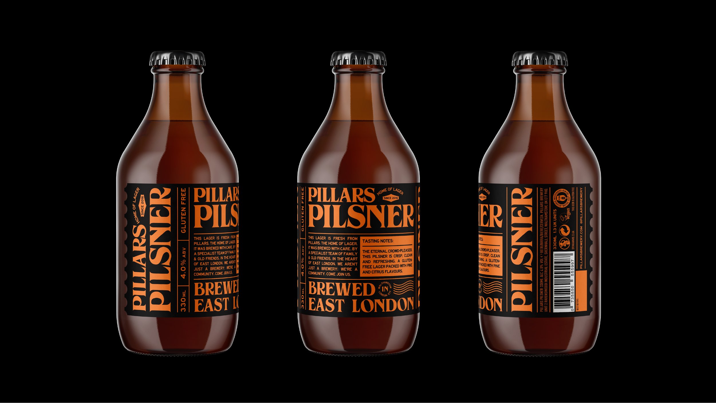
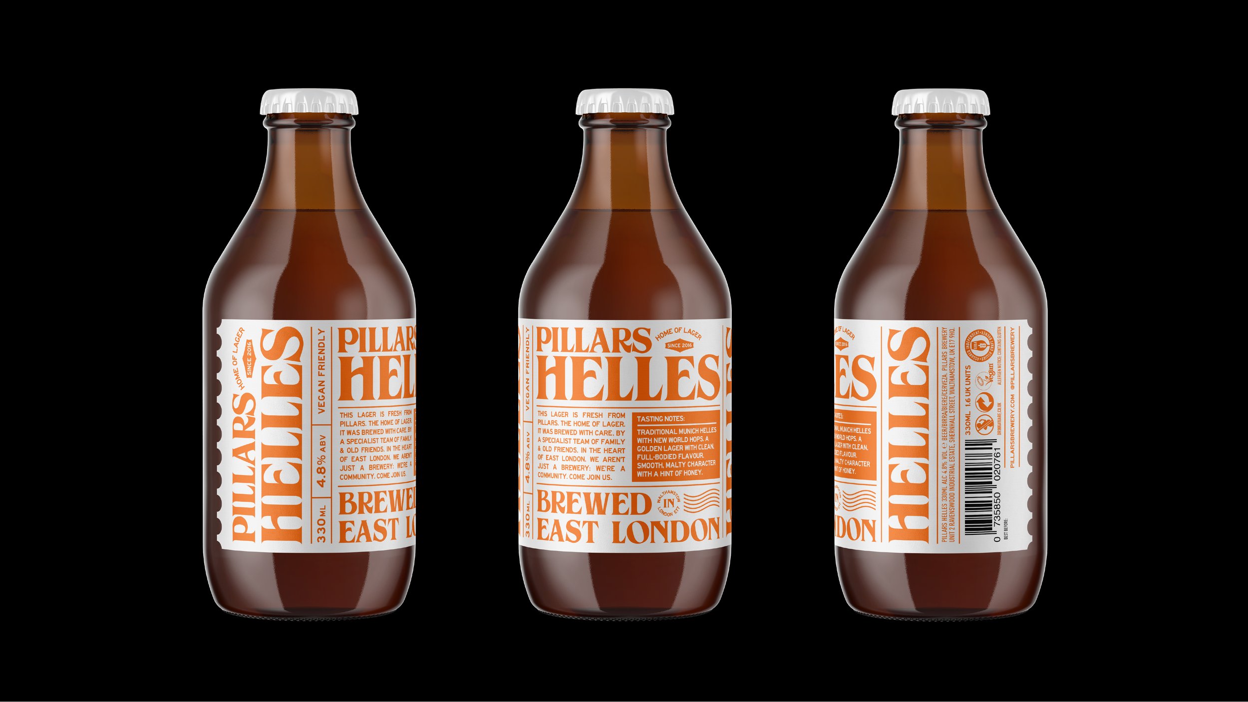
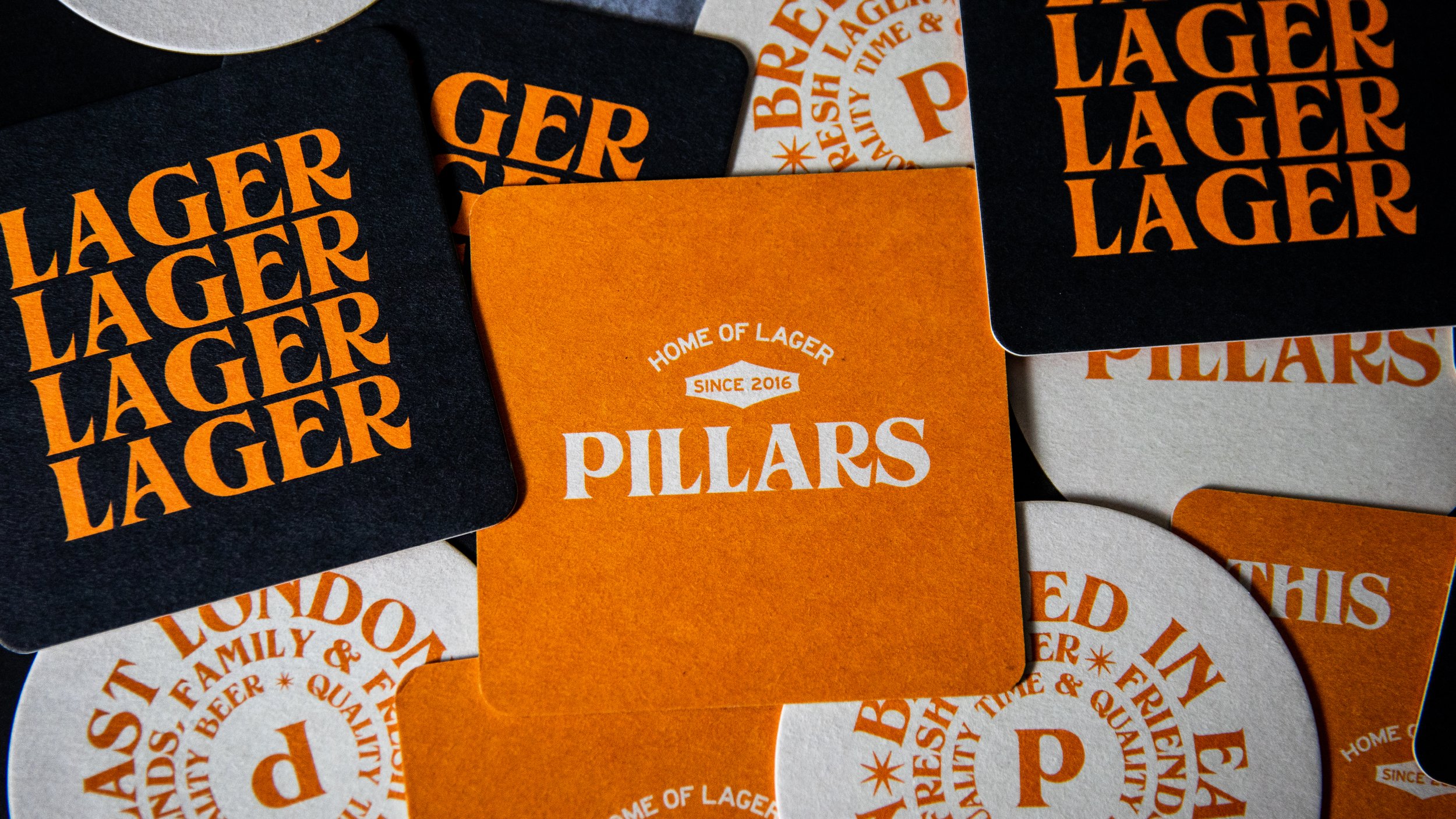
They needed a brand as confident as their beer. The solution was a ground-up rebrand built on a new, powerful positioning: 'The Home of Lager.' This idea became the foundation for a cohesive brand universe.
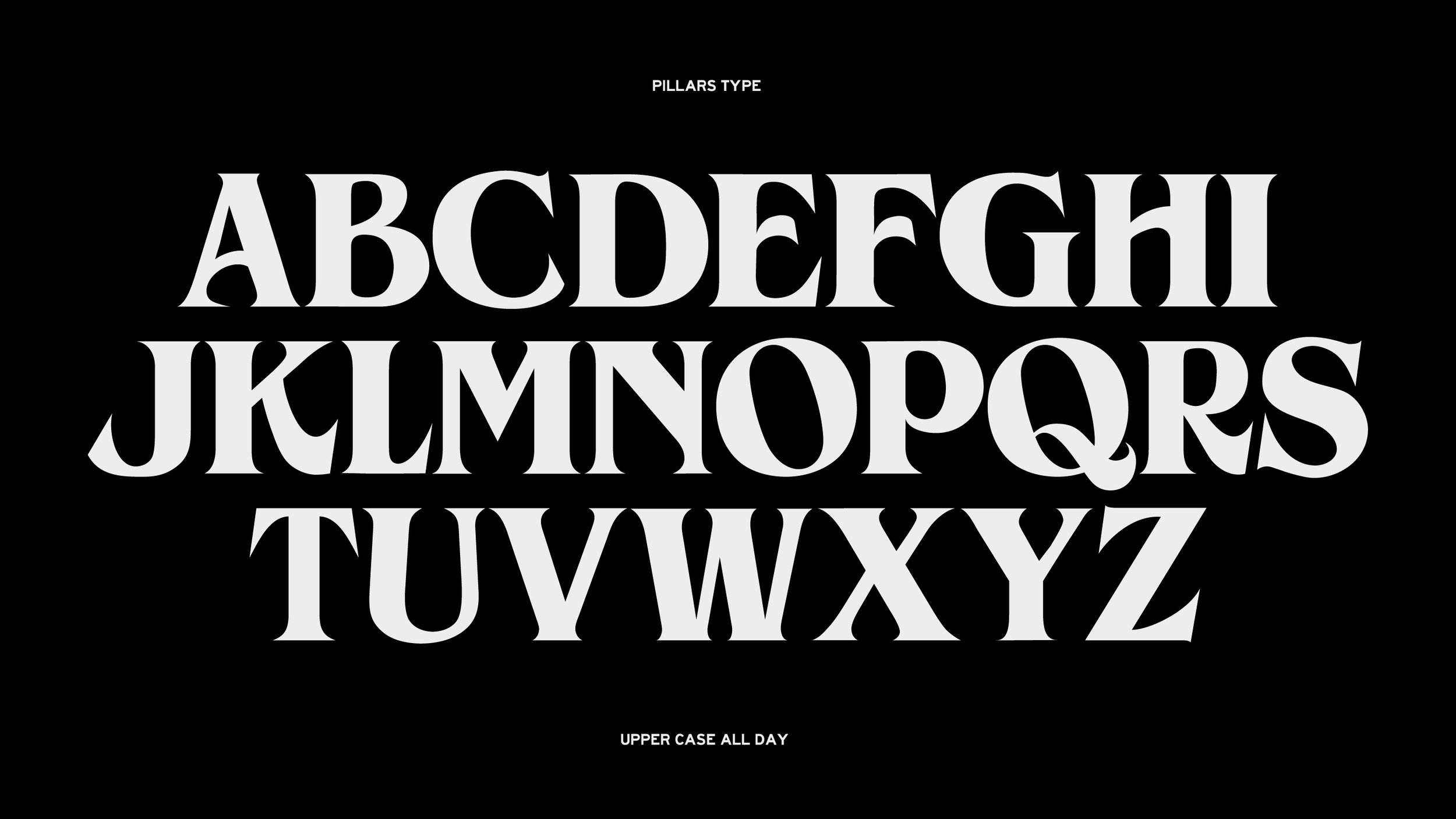
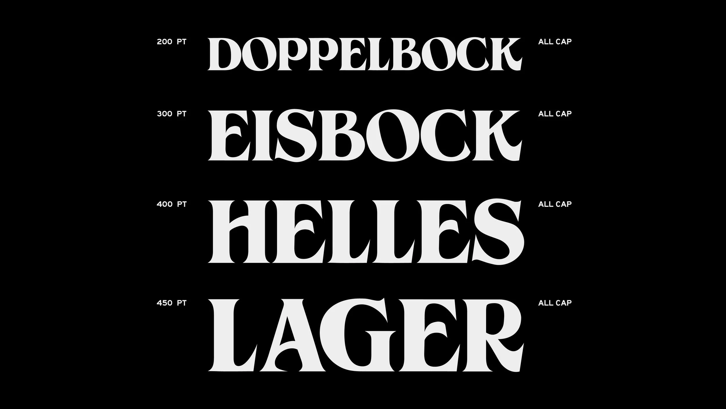
At its heart is a custom brand typeface inspired by the rich typographic vernacular of East London—from ghost signs on old factories to the signage of local, independent businesses. This typeface, paired with a now-iconic flash of orange, created an authentic and uniquely London identity. It's a flexible system designed to work seamlessly across all touchpoints—packaging, social media, merchandise, the taproom, and the trade.


